
Photo book with text: words that read well in print
Write your own text before laying out the pages. Test a crowded spread at its final size with the intended reader, then use those readable type settings and check every name on the print proof.
Text in a printed book cannot be corrected once it arrives. A misspelt grandparent's name lasts as long as the book, so the words need as much checking as the photos.
Decide early how much there will be. A book with a paragraph on every spread needs different layouts from one carrying dates and names alone.
Make your photobook
Arrange your photos on A4 pages, check the proof and order a printed copy.
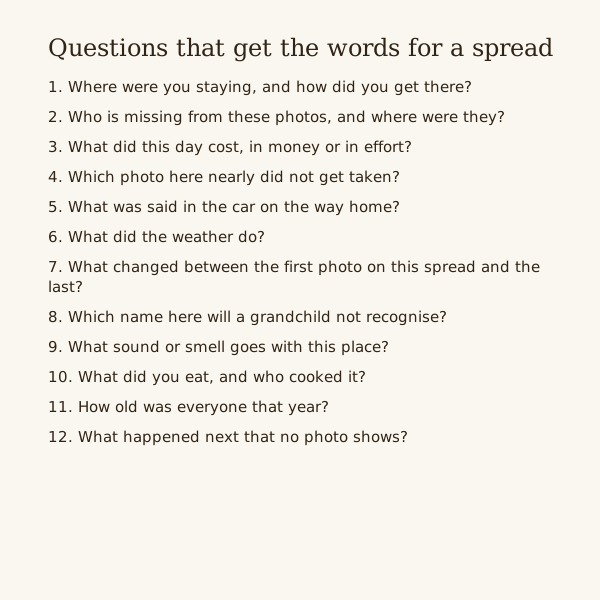
Questions that get the words for a spread
- Where were you staying, and how did you get there?
- Who is missing from these photos, and where were they?
- What did this day cost, in money or in effort?
- Which photo here nearly did not get taken?
- What was said in the car on the way home?
- What did the weather do?
- What changed between the first photo on this spread and the last?
- Which name here will a grandchild not recognise?
- What sound or smell goes with this place?
- What did you eat, and who cooked it?
- How old was everyone that year?
- What happened next that no photo shows?
Three amounts of text, and the space each takes
Dates and names only: a line under each photo or one label per spread. Photos can stay as large as the page allows.
A caption per photo: a line or two beneath each picture, which means smaller photos or fewer of them on a page.
A short paragraph per spread: thirty to eighty words in one block, often in a corner or on a band across the foot of one page.
Mixing all three across a book makes it look unplanned. Pick one as the rule and break it only for a page that needs more.
Type that reads on paper
Typeface, weight, contrast and the reader all affect the size needed. Try a few settings on the busiest page and choose from a full-size print, not a fit-to-screen preview.
Ask the intended reader, where possible, to read a full-size test at a comfortable distance. Increase the type or shorten the text if they need to strain; do not force it to fit.
Split long paragraphs into a narrower column beside a photo. Compare two column widths on the test page and keep the one that can be read without losing the next line.
Black or dark grey on a pale ground is safest. Pale text on a coloured background can look fine on a lit screen and go flat on paper.
Away from the fold and the trim
The gutter is the fold down the middle of a spread. Words near it curve into the binding, so keep text on the outer part of each page.
Pages are trimmed after printing, and the cut can wander a little. Keep text inside the printer's safe area, not merely inside the page edge.
In tbf scrapbook a print proof comes before ordering an A4 portrait or landscape book. Read the words there, not only in the editor.
Words on top of a photo
Put text over sky, a wall or sand, never across faces or busy detail. Check the darkest part under each letter as well as the lightest.
If no calm patch exists, set the words on a solid panel at the photo's edge, or move them to the facing page.
Reading it before it prints
Check names against a source: a birth card, an order of service, a relative who knows. Then check dates against the photo files.
Read the proof one spread at a time, names first, then dates, then everything else. A single sitting through the whole book lets mistakes slip by.
A spellchecker set to American English will mark British spellings as errors. Set the language before the final read.
Keep a list of spread number, text file and unresolved name or date. Mark each item as checked before copying the final words into the design.
Steps
Write the words in one document
Number each spread and write its text beside the number, before any layout. Editing a list is quicker than editing forty pages.
Set the styles once
Choose one typeface, a paragraph size, a caption size and one colour. Apply them the same way on every page.
Print a test page
Lay out the busiest spread and print it at full size at home. Read it at arm's length and fix size and spacing before doing the rest.
Proof with a second reader
Go through the proof spread by spread with someone who knows the people. Order only when both of you have read every name.
Questions
What size should text be in a photo book?
Use a full-size print to choose with the intended reader. Typeface and weight change legibility, so there is no single caption or paragraph point size that fits every photo book.
How much should I write in a photo book?
Enough to name the people and places a reader in thirty years will not know. Beyond that, one short paragraph per spread is plenty for most books.
Can I put text over the photos?
Yes, over a plain area such as sky or a wall. Avoid faces and busy patches, and read it on the proof, since text that stands out on screen can sink into a print.