
Scrapbook lettering ideas you can do with a fine pen
Start with plain capitals, then try tall lower case, faux calligraphy and outlined block letters. Pencil the title first, space it from the middle out, and ink only when it fits.
Hand lettering on a scrapbook page is usually a title of one to four words. That is short enough to practise several times before it goes on the real page.
Print the practice sheet below, try each style on its line, then rough out your actual title at full size in the open space.
Put these words on a page
Add your photos and write beside them in a digital scrapbook.
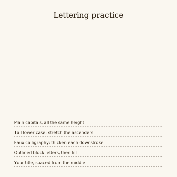
Four styles for one pen
A fine liner around 0.5 mm covers all four. Practise them in this order.
- Plain capitals: upright, equal height, drawn between two pencil lines.
- Tall lower case: small body letters with long ascenders and descenders.
- Faux calligraphy: write the word, add a second line beside every downstroke, fill the gap.
- Outlined block letters: draw each letter as a shape, ink the outline, then fill it or leave it hollow.
Spacing a title before you ink
Measure the space, then write the title on scrap paper at the size you want. If it is too long, change the size or the words, not the gaps.
For a centred title, draft it on scrap paper first, mark the middle of the whole word shape, and line that mark up with the centre of the title area.
Round letters such as O and C sit slightly closer to their neighbours than straight ones like H and I. Judge gaps by eye, not with a ruler.
Leave a gap between words about the width of a lower case o.
Pens, paper and testing
Try the pen on an offcut of the paper you will use. Some coated and patterned papers make ink bead, spread or take longer to dry.
Wait until the ink is fully dry before erasing pencil guidelines. A soft white eraser lifts graphite with less smudging.
Brush pens give thick and thin strokes from pressure alone, but take longer to control. Faux calligraphy gets a similar look with an ordinary fine liner.
What usually goes wrong
Titles drift uphill without a guideline. Pencil a base line and a cap line, even for one short word.
Running out of room at the right edge squashes the last letters. Rough the whole title in pencil first.
Several styles on one page compete with each other. Use one for the title and plain handwriting for the captions.
For a digital book, letter the title on white paper, scan or photograph it in even light, and place the image on the page.
Rescue an inked mistake
Make the title on a separate strip of the same paper before attaching it. If a letter smears or the word runs long, replace the strip rather than covering part of an original photograph.
Steps
Draw guidelines
Pencil a base line and a cap line at the height you want the capitals. Add a middle line if you are lettering in lower case.
Rough the title
Draft the complete title on scrap paper at full size. Mark its visual centre, align that to the page centre, then transfer a light pencil version.
Ink it
Go over the pencil with the fine liner, one steady pass per stroke. Add the faux calligraphy thickening or block outlines at this stage.
Clean up
Let the ink dry, then erase the guidelines. Fill any small gaps in solid letters with the same pen.
Questions
What pen is best for scrapbook lettering?
A fine liner between 0.3 and 0.8 mm covers most titles. Add a brush pen once plain capitals and faux calligraphy feel steady.
How do I make my handwriting look neater for titles?
Use pencil guidelines, write more slowly than usual and keep letters the same height. Plain capitals are the easiest style to make look even.
Can I hand letter a title for a digital scrapbook?
Letter it on paper, then scan or photograph it and add the image to the page. A stylus on a tablet also works if your editor accepts drawing.